ALL ABOUT HUE
Photo by D. Finnin/AMNH
All About Hue is an interactive game show to explore how colors make us feel, designed for The Nature of Color exhibit at the American Museum of Natural History.
ROLE: UX Designer, Visual Designer
TIMELINE: 6 months
SKILLS: Experience Design, UI Design, Graphic Design, Prototyping, User Research
TEAM: AMNH Exhibition Media Team
EXHIBITION: The Nature of Color at AMNH (Mar 2020 - Aug 2021)
How can we introduce new interactions to the museum setting?
BACKGROUND
The Nature of Color exhibit was designed to have several different rooms designated by color and theme. My role focused on the UX and Visual Design of the media interactive in the yellow room. This room’s theme was “Feeling Color”, where museum visitors explore the emotions and perceptions of color.
We designed a game show that asks participants questions about color. The results are collected live and displayed in real time. In a completely new style of interactive for AMNH, visitors can play not only on installed touchscreen kiosks but also on their own personal mobile devices.
Our goal was to create a simple, educational, and engaging experience that used digital interfaces in new ways.
RESEARCH & IDEATION
USER FLOW
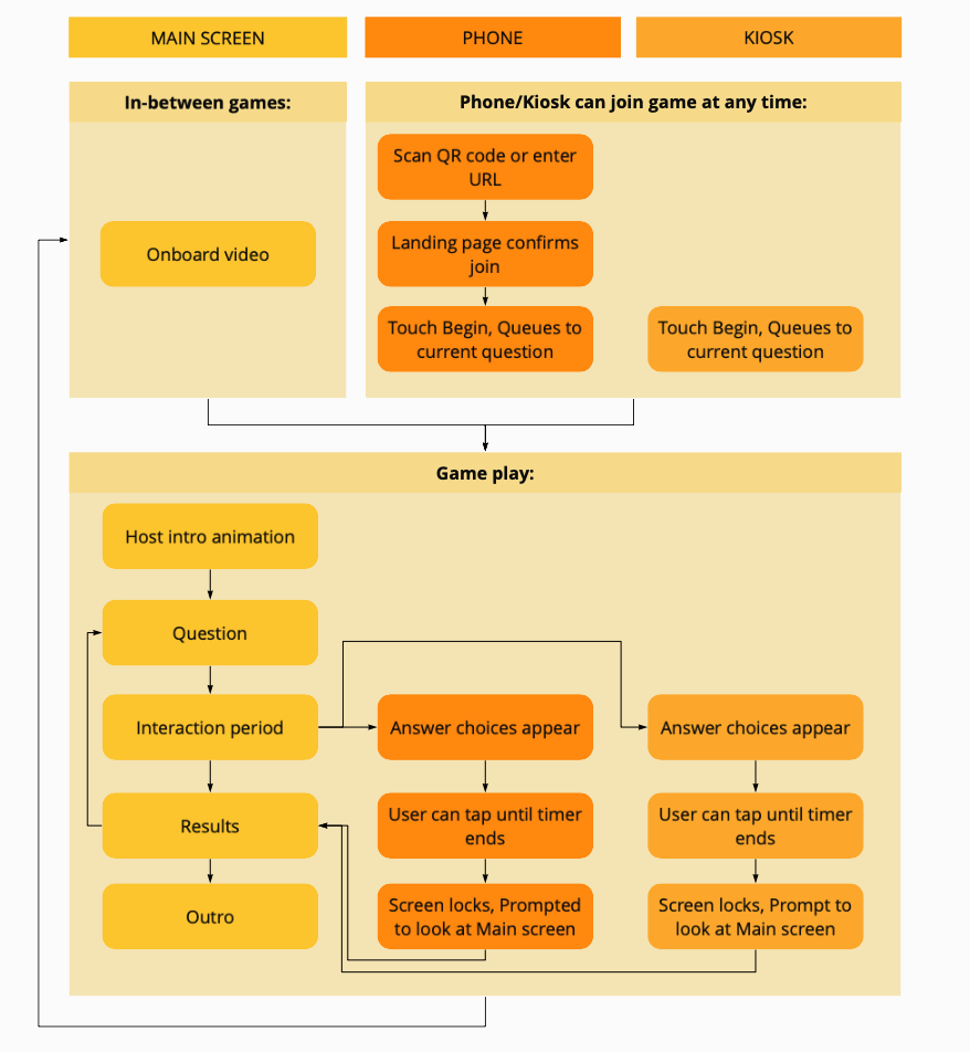
We looked at existing quiz game applications like JackBox and HQ Trivia for inspiration. Our research led to devising an initial structure of a dialog between personal devices and the main screen in the gallery. I designed the user flow around this back and forth interaction in order to heighten the collective experience.
The numbered hexagon became the visual marker to symbolize a player’s ID/answer to the question.
DATA VISUALIZATION: WHAT DOES AN I.D. LOOK LIKE?
Since this interactive collects and displays user responses, I had to consider early on: What does this data look like? How do participants see both their individual answers and the group results simultaneously?
After many iterations, we landed on a numbered hexagon shape.
SHAPE: Data points with the same shape maintain a uniform aesthetic to the dataset as a whole.
COLOR: This is a variable that changes according to a player’s answer choice.
NUMBER: Unique to each player, this helps distinguish a person’s answer from crowd.
My idea was that knowing how to point out your own response amongst a collective would encourage interaction not only with the screen but also with those physically around you.
DEVELOPMENT
This interactive is a complex system. Since the main screen acts as a call and a separate device (mobile/kiosk) as response, there are moments of both passive and active engagement that may be unfamiliar to the user.
In my design, I had to ensure that it was clear which screen to interact with at what times and that the visual aesthetic between devices felt unified.
Designing for 7 different questions with content for main screen, mobile, and kiosk.
Main Screen Question. IDs pop up grayed out as players join and answer within the time limit.
Interaction Period. On either mobile or kiosk, players interact by selecting their answer. The chosen color is outlined in white on the palette and the ID hexagon changes color to match.
Prompt. Once the timer runs out, selection is no longer possible and players are prompted to draw their attention back to the main screen.
Main Screen Results. The grayed out IDs fill in color to reveal what players had answered. The animated host (created by Bob Peterson) discusses the results and provides a fun fact about color.
DESIGNING WITH COLOR FOR COLOR: VISUAL CHOICES
Having the entire interactive revolve around ever-changing color, it became a true visual design challenge. I kept the overall design simple and minimalistic with a dark background color and only one other yellow-orange color for assets like the progress bar and timer. This allowed the animated host and the data to stand out most. Visual interest is sustained throughout the game by balancing a variety of different question types, user interactions, and data visualizations.
TESTING
With so many moving parts of this interactive, user testing was crucial! Two meaningful findings really shaped the final product:
TIMING: A GOLDILOCKS EFFECT
Screenshot of onboarding animation demonstrating side by side instructions. Equal visual weight for join options improved usability.
If players are rushed to answer questions they will get frustrated. Too long of a timer, and players become bored. User tests helped us settle on what was just the right length of time to answer questions, as well as the length of the whole game, and even wait time between games.
ONBOARDING: GETTING OFF TO A GOOD START
No matter how many times you run through an interaction in your head, there will always be something unexpected that shows itself in testing.
When creating an onboard animation, I focused on making sure visitors would be comfortable joining the game on their phones. However, in the gallery, visitors could be standing in front of the kiosks and instead, use their phones because they thought this was the ONLY way to play. After several iterations, I redesigned the onboard animation to include both instructions for mobile and kiosk simultaneously.
FINAL PRODUCT
Visitors really enjoyed the experience of All About Hue! It maintained the museum’s mission of learning through playful animations of the host character, while providing a space for fun and self-reflection. Adding the element of phone interaction allowed for increased dwell time and higher simultaneous participation than other museum interactives. Since All About Hue offered an alternative to tangible interaction, it was one of the few pieces that visitors could still play with when AMNH reopened. It is exciting to think that this project could set precedence for how future interactive exhibitions operate in a post-coronavirus society.
Photo by Maya Pruitt


