The time has come! After a whole semester developing this project, I’m proud to show how far it has come.
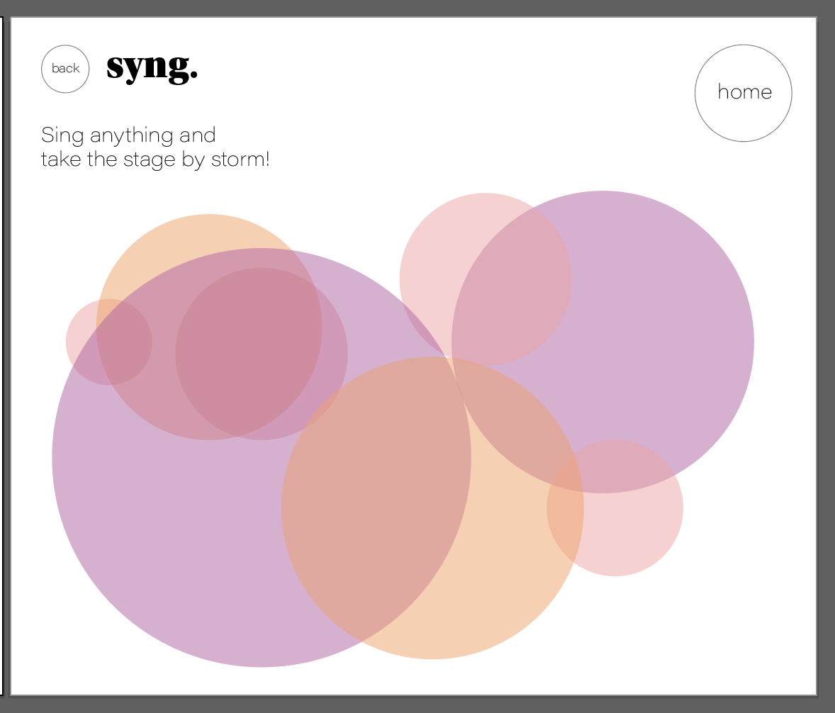
Post User testing, I decided in this last week to retain a lot of the existing functionality because it actually went over quite well. Why fix something that’s not broken. I put my attention towards aesthetics to highlight its simplicity. It is a visual piece and should look the part!
I learned so much about HTML and CSS. It was amazing to feel that in control of aesthetics of web design. I played with some different mappings in the performance mode, but felt it already looked the best that I could make it. I did successfully change the mapping on pitch match to be a bit smoother, which felt like the area that needed it the most. Lastly, I was able to combine the pages so that it truly feels like a navigable website.
I decided to emphasize the order and make it feel more like a progression. Each mode builds off the next.
In future iterations, I would love to add a harmony mode with color mixing and experiment with multiple mic input so it can be a collaborative experience.
Visual Style Guide:


