TEXT MESSAGE PERCEPTIONS
I am a big texter. So much so, that I believe it influences a lot of the relationships I have with people. While, we often criticize using phones too much, my perception of text messaging is that it helps those that are physically far from me feel much closer. With this self portrait, I wanted to visualize these perceptions.
SYNTHESIS
Apple stores text message data in a chat.db file in your Library (sometimes hidden). I granted my terminal full access to my disk to navigate to this hidden file. Using SQLite, a downloaded database engine, we can parse through the database to see what’s in there. Interestingly, text message information is stored in different places. Time & date was stored in a “messages” table, but who the sender was stored in “chat”. This required a bit of finagling to join the tables to better parse through them. Ultimately, I wrote a query to request data, in order to collect information under certain parameters. For this visualization, I was more interested in how often messages were sent and by who, rather than the content.
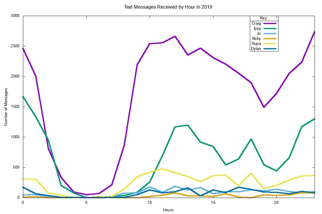
This information was plotted in Gnuplot (a command line utility tool) to make an initial chart. Here we can see the aggregate data of text messages over an entire year displayed by hour of the day. We see when people text me most often, but also who texts me the most. As expected, my long distance boyfriend of over 4 years has the largest number of text messages. Where my mom and I barely text - though this makes sense because I live at home.
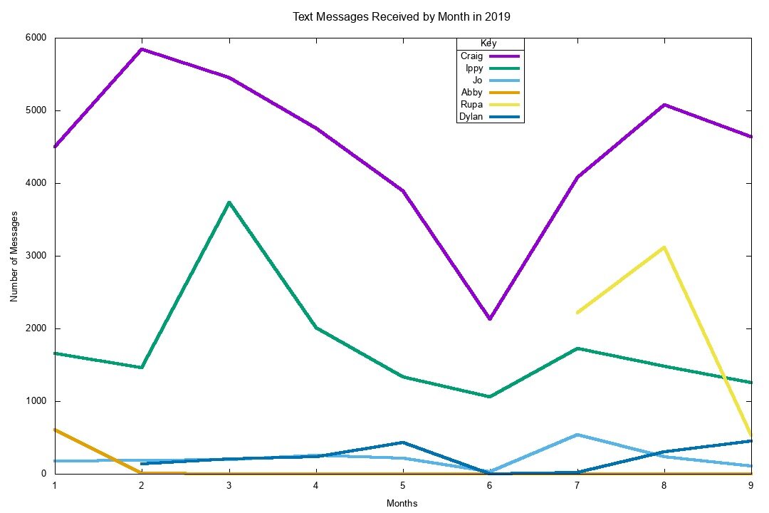
This graph shows the number of text messages received by month, which illustrates communication over the whole year. Rupa, for example, I didn’t meet until this summer.
VIZUALIZATION
For this visualization, it was important to me to illustrate the feelings that text messaging creates more than the actual numbers (though they are also fascinating). I wanted to map the number of text messages received to the brightness/alpha of an ellipse as a nod to the screen light of a phone turning on. Loneliness is sometimes equated with darkness, so the bright text message circles are meant to show how it brings lightness to a dark space. The distance lines shrink as the text message number increase, to show that tho physically far, my perceived distance of a person changes depending on how often they text me. Lastly, a happy accident of interpolation, those that text me most often caused the hour of time to change more slowly, but I liked that this was a metaphor of another perception one can feel when communicating with those they love.
REFLECTION
HUGE SHOUT OUT TO MY S.O. CRAIG! He is a computer scientist and without his knowledge, I would not have even been able to retrieve this data set.
This was difficult. I wanted to push myself beyond a simple chart and really think about how animation can show change over time. In the future, I would want to have clearer graphic design intentions. I am curious how best to label information? More or less? How much room should you leave for interpretation?


